Designing FAB mobile banking app and resulted 42% increase in overall user engagement
- User engagement increased by 42%.
- Positive feedback on the easy onboarding process and dashboard design.
- Enhanced security features were well-received by users.
- Created initial design concepts and established UI patterns.
- Created prototype in Flinto for usability testing.
- Be the voice to the team, conducting requirements gathering and technical meetings.
- Communicate with the client and get sign-offs when required.
- Helped the design team learn and made sure delivering a quality product.
- Continuous support to the engineering team.
First Abu Dhabi Bank (FAB) emerged as the largest bank in the Middle East following the successful merger of two prominent financial institutions: First Gulf Bank and National Bank of Abu Dhabi. The synergy of the two banks presented an opportunity to reevaluate and enhance the overall banking experience for its vast customer base.
The client provided a detailed list of features to be included in the mobile banking app. The team committed to providing design solutions in four sprints. The initial sprint focused on delivering key features along with their associated wireframes and UI designs.
To start with, the team conducted a competitive analysis, we examined leading banking applications to gain insights, identify best practices, and discover areas for innovation. Study focused on 5 main areas:
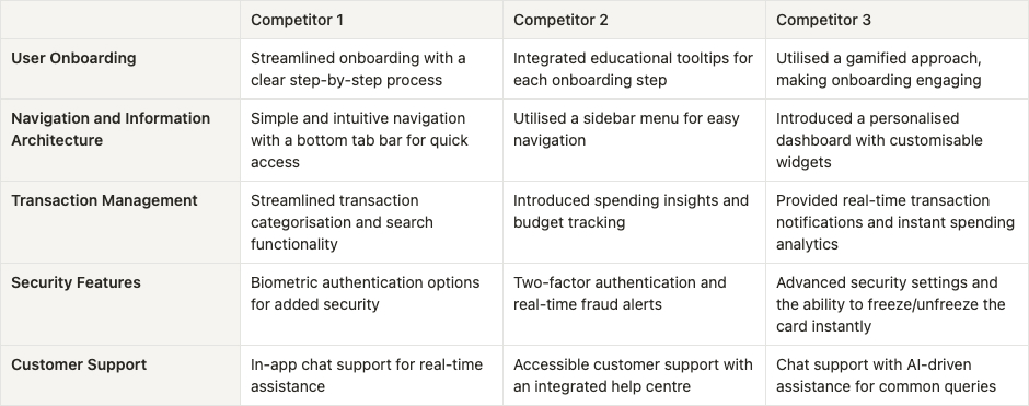
* Name of the competitors are not exposed due to the security reasons
- Streamlining onboarding with educational elements enhances user engagement.
- Utilising intuitive navigation, such as tab bars or sidebar menus, ensures a seamless user experience, while personalised dashboards boost engagement.
- Improving transaction management with categorisation, search, spending insights, and real-time notifications empowers users for better financial control.
- Integrating biometric and two-factor authentication, along with real-time security alerts, is crucial for building user trust and ensuring a secure banking experience.
- Providing convenient in-app customer support, including contact centre informations and hotlines.
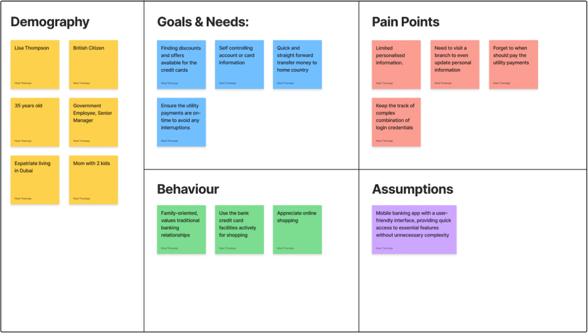
We talked to members of the bank ranging from C-suite personnel to the Customer Service Officers - to get an understanding of the users. Based on the insights gathered we created a single persona:
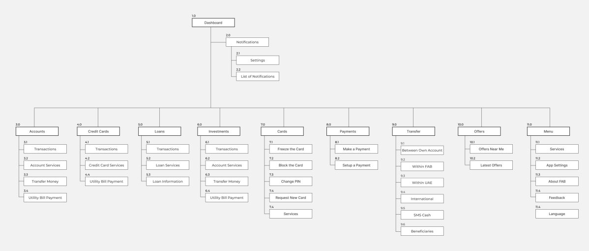
Conducted workshop to ideate Information Architecture with stakeholders from the client side to collaboratively define the initial information architecture. The following diagram is the final version after the testings and feedback sessions.
During the initial meetings with the stakeholders, we identified 3 key user journeys that really matter to the users and have an impact to the business.
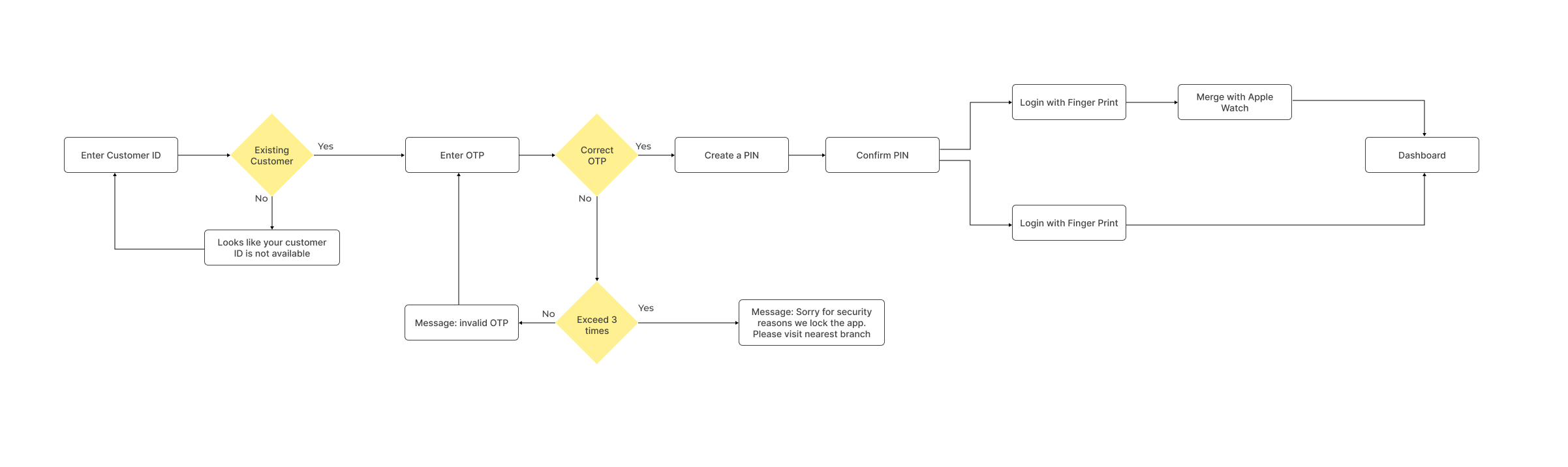
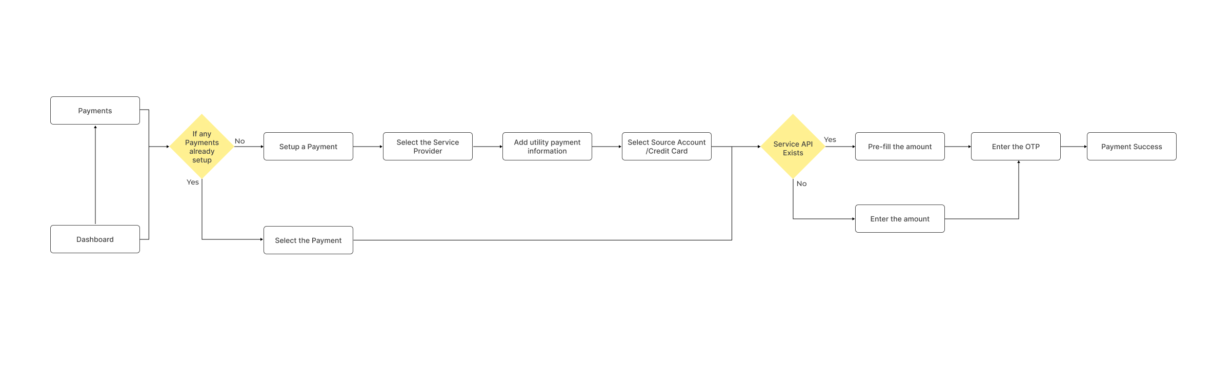
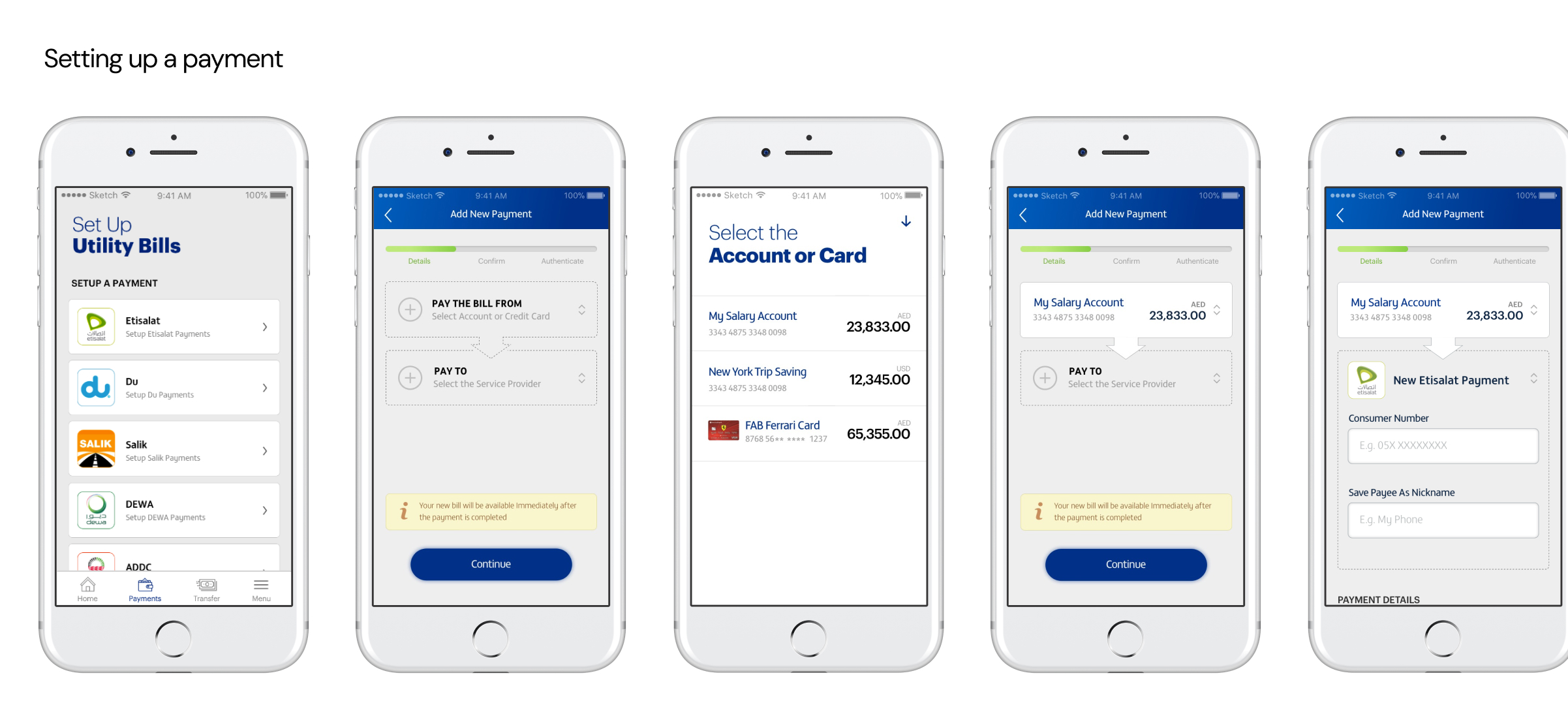
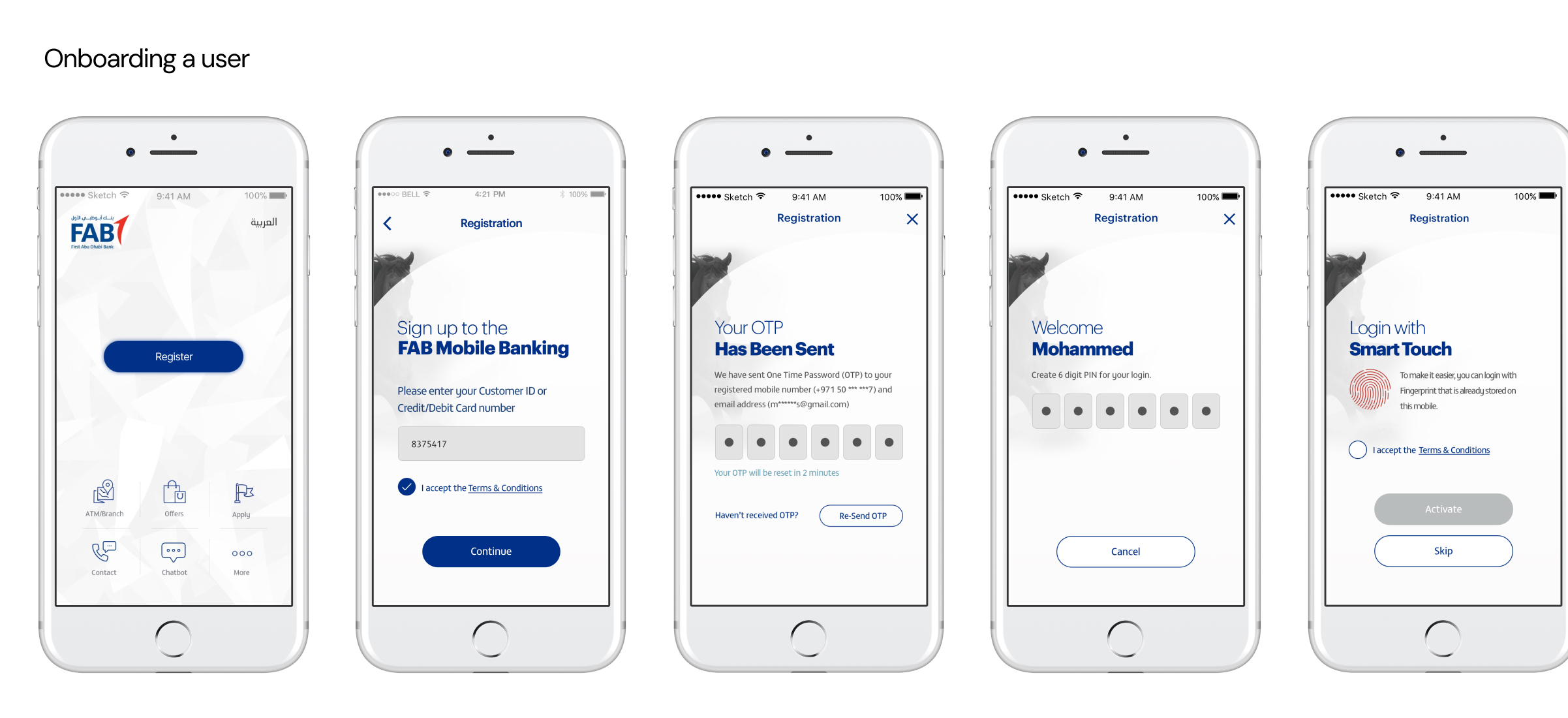
We focused to create wireframes for the key user journeys we identified.
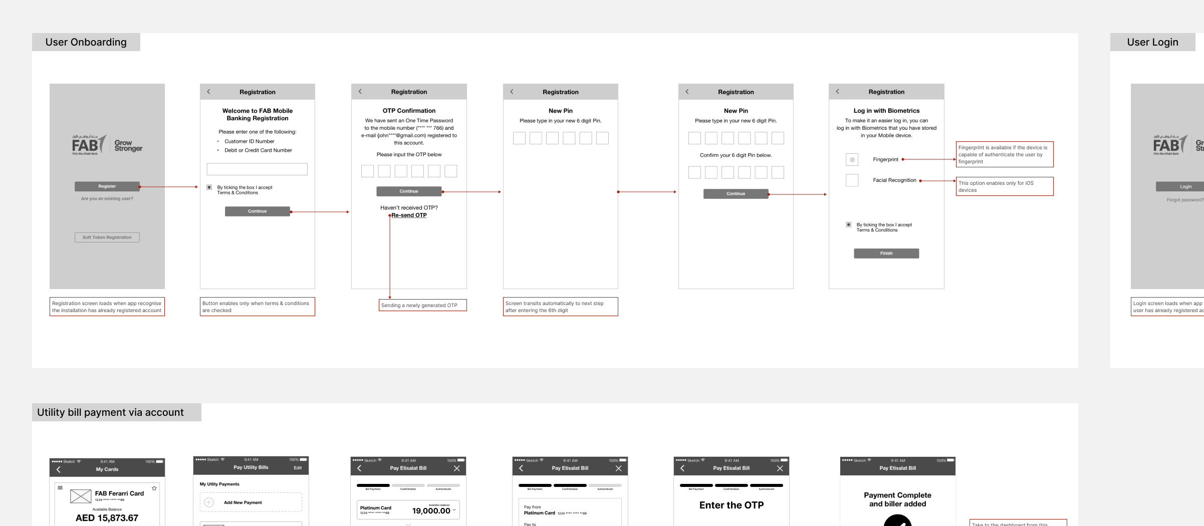
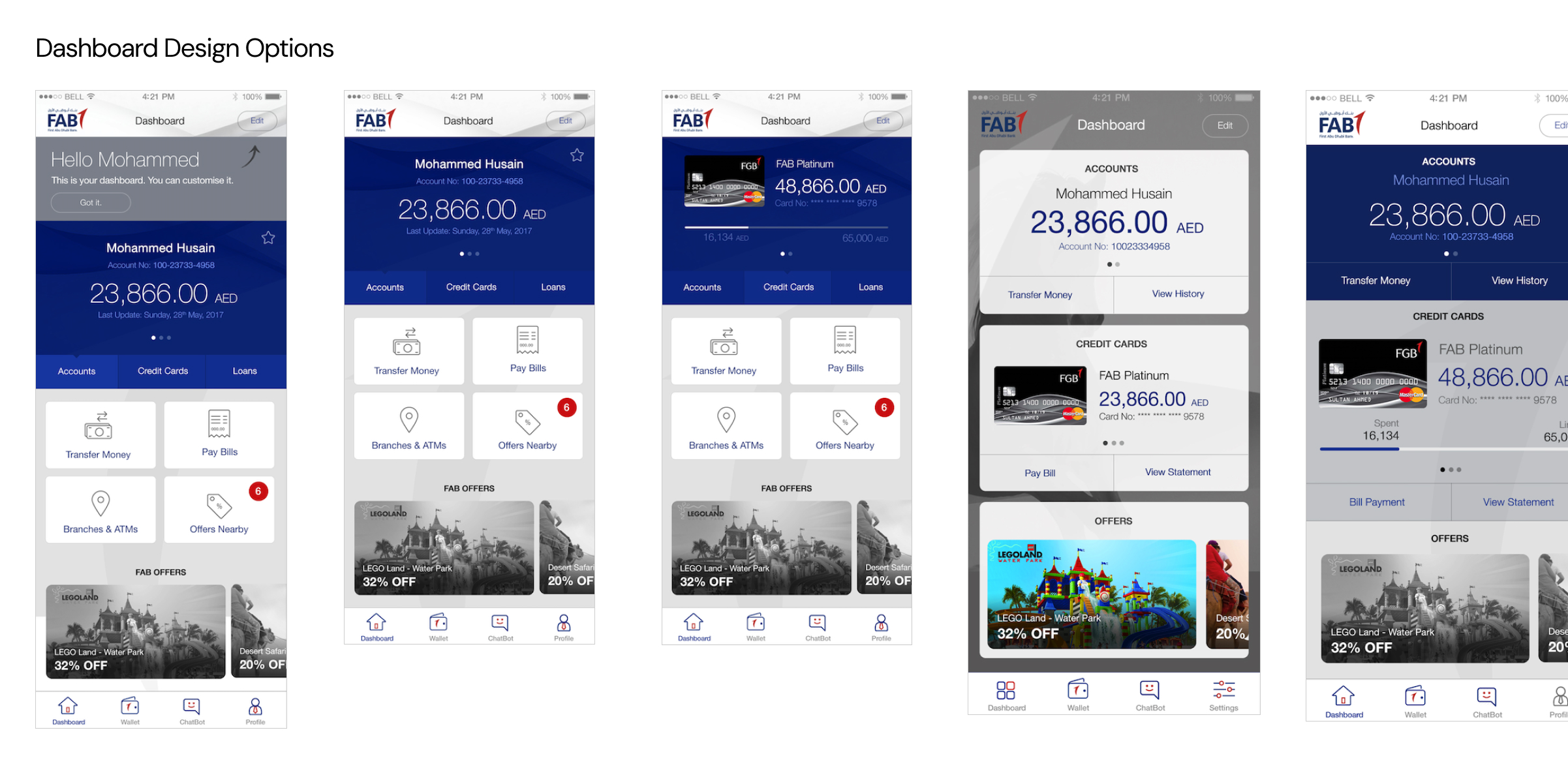
After the initial set of wireframes are established we explored some UI concepts for the mobile application.
Since our design solution contained modern interactions, we decided to test them extensively. Drawing from my past experience with the Flinto application for crafting lifelike experiences, I proposed using Flinto for all our prototypes. This tool offers flexibility in creating the interactions we aim to test.
Before the development start with the UI deliverables of the first sprint, we conducted 2 usability test sessions aiming 2 different objectives:
- We created a rough guidance which contains the points we wanted to test and validate with the users.
- We recruited total of 20 customers from the bank that covers different demographics and product types, but 3 customers were absent.
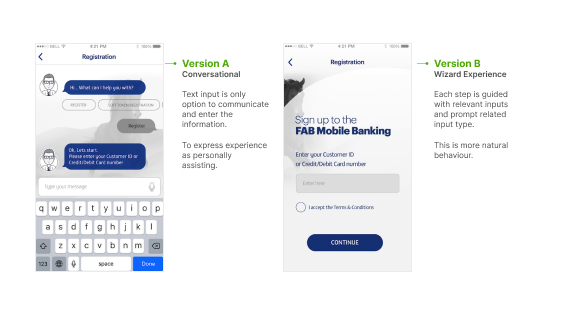
- We created 2 concepts for the onboarding process:
- Fab-bot - conversational process
- step opened by step opened wizard process
- Identify most convenient and trustable onboarding concept.
- To determine how fast and confidently finish the onboarding process.
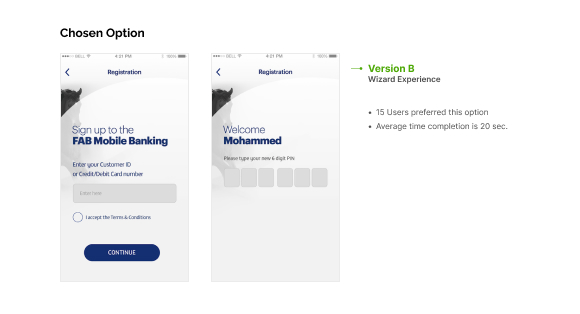
- Except 2 young participants, all others preferred to use simple wizard approach. But those 2 participants took a few minutes longer than to wizard option to complete onboarding.
- Users felt chat bot process is unsecured as they have to create PINs and passwords which felts sharing with someone.
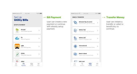
- Transfer money from user's account to a friend from another bank in the UAE
- Make an utility bill payment from user's credit card
- To observe how easy the user to find the initiative point.
- To understand how easy the user can figure out the UI and interaction pattern.
- To determine how confidently the user navigate through the process.
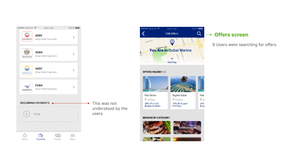
- Majority of the users confused with the term “Recurring payments” which is to setup a payment to trigger automatically.
- Considerable amount of users were looking for offers after the main user journey we tested.
Based on usability testing feedback:
- We updated the information hierarchy with adding Offers button in to the main navigation instead of “more” option button.
- We change recurring payment terminology to “Automatic Payment” as most of the users understand it.
- We updated the proto-persona of the “Lisa Thompson” to accommodate the interest around the offers..
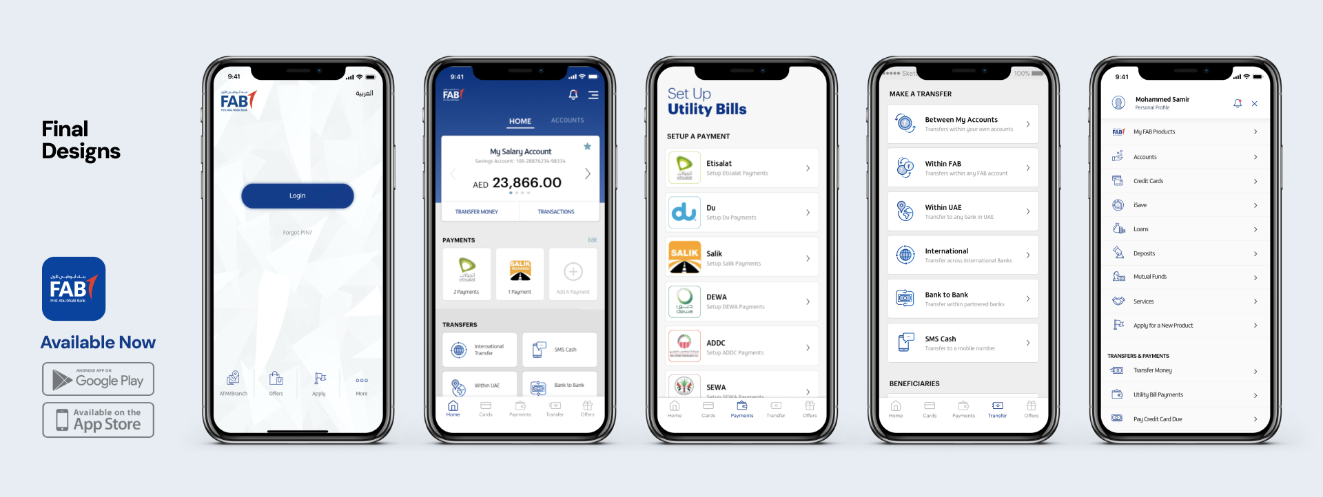
The completion of the final designs of the first sprint were the result of iterative refinements guided by usability test data. We started with a basic design guide and patterns, and used them to create the rest of the designs in later stages. This helped keep everything consistent and made sure the app was easy to use, combining what users liked with good design practices.
- We used Zeplin to hand off the design specifications and assets to the engineering team.
- Created detailed mockups, and style guidelines through the Zeplin.
- Also created detailed animated videos to guide the interactions to be implemented.
- Problem: We faced an issue with vectors downloaded from Zeplin that needed to be used on the Android platform.
- Solution: we edited the XML representing the vector nodes.
- We provided continuous support to the engineering team.
- We answered questions, provided feedback, and made modifications to the designs as needed.
- We visited the engineering team on-site every week to help them implement the designs correctly.
- Gathered post-implementation user feedback through in-app surveys and reviews.
- Compared metrics using data from earlier mobile banking apps.
- Monitored key metrics, such as user engagement, successful transactions, and app ratings.
The following figures shared by customer support team
Navigating the inclusion of over 50 banking transactional features taught us valuable lessons in managing feature complexity. Striking a balance between a comprehensive feature set and a streamlined user interface required continuous evaluation and prioritisation.
One significant lesson learned during the project was the importance of iterative collaboration between design and development teams. Early collaboration led to a more seamless integration of features and smoother transitions between design and implementation. Regular check-ins and feedback loops improved communication, enabling us to address potential roadblocks before they became significant issues.